
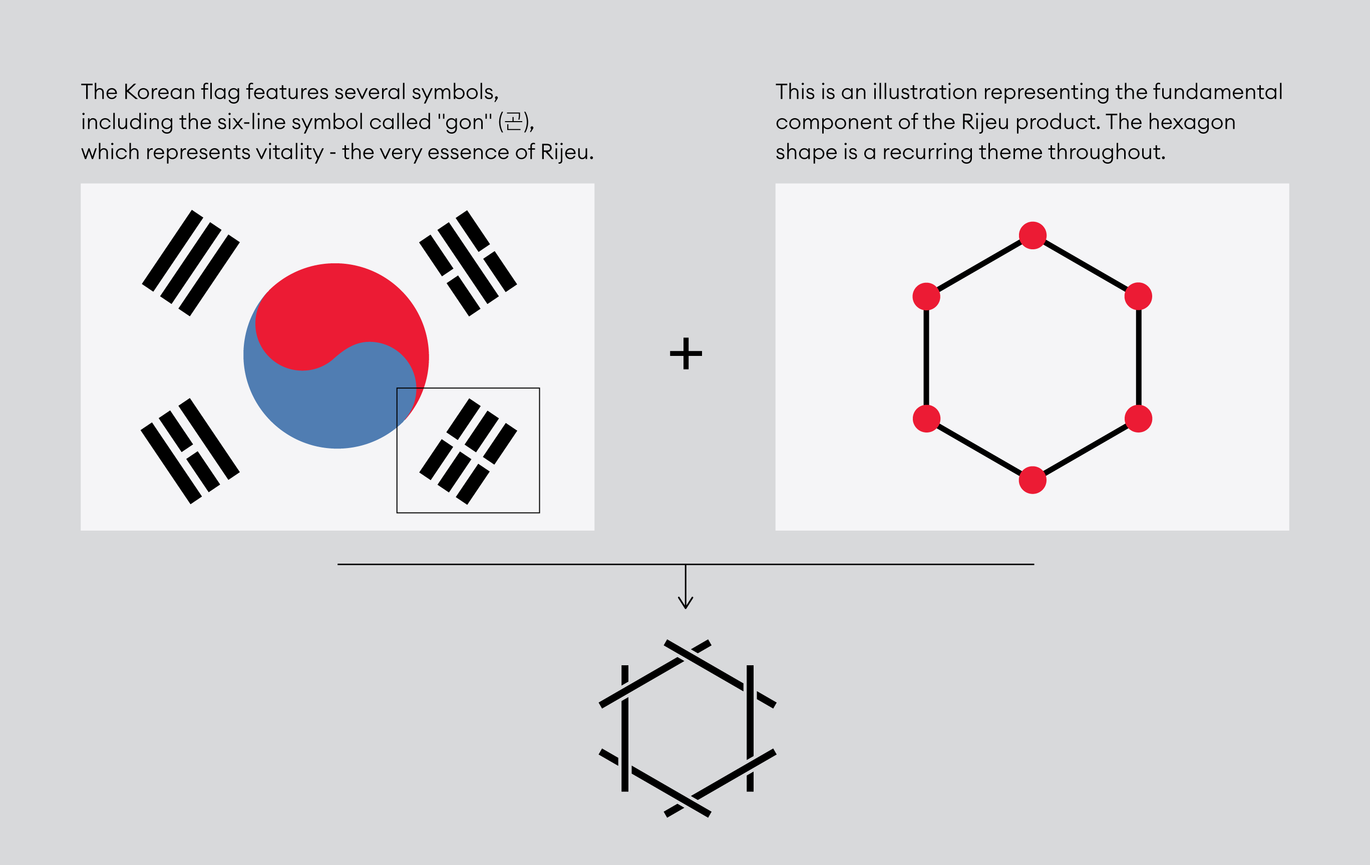
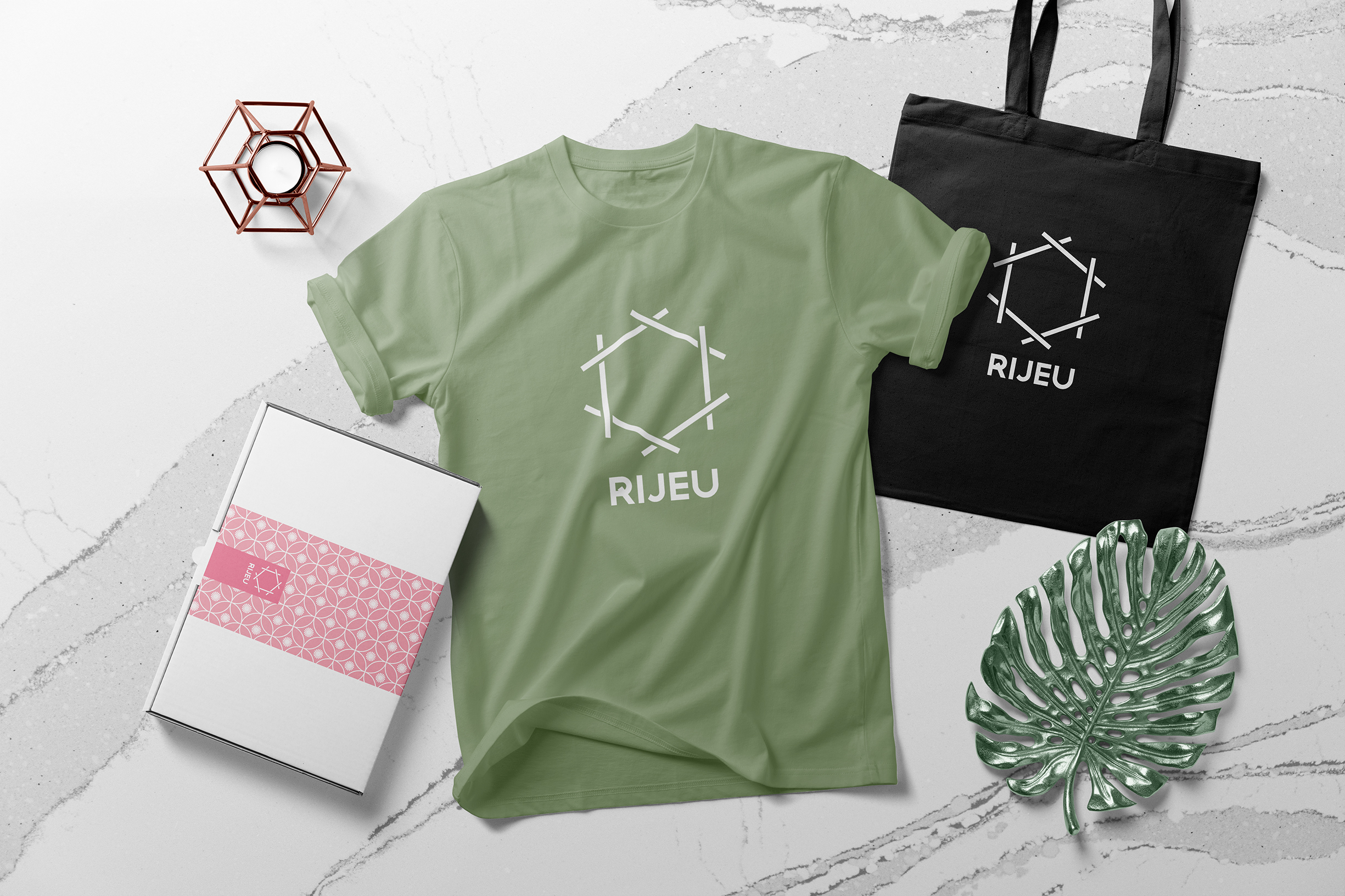
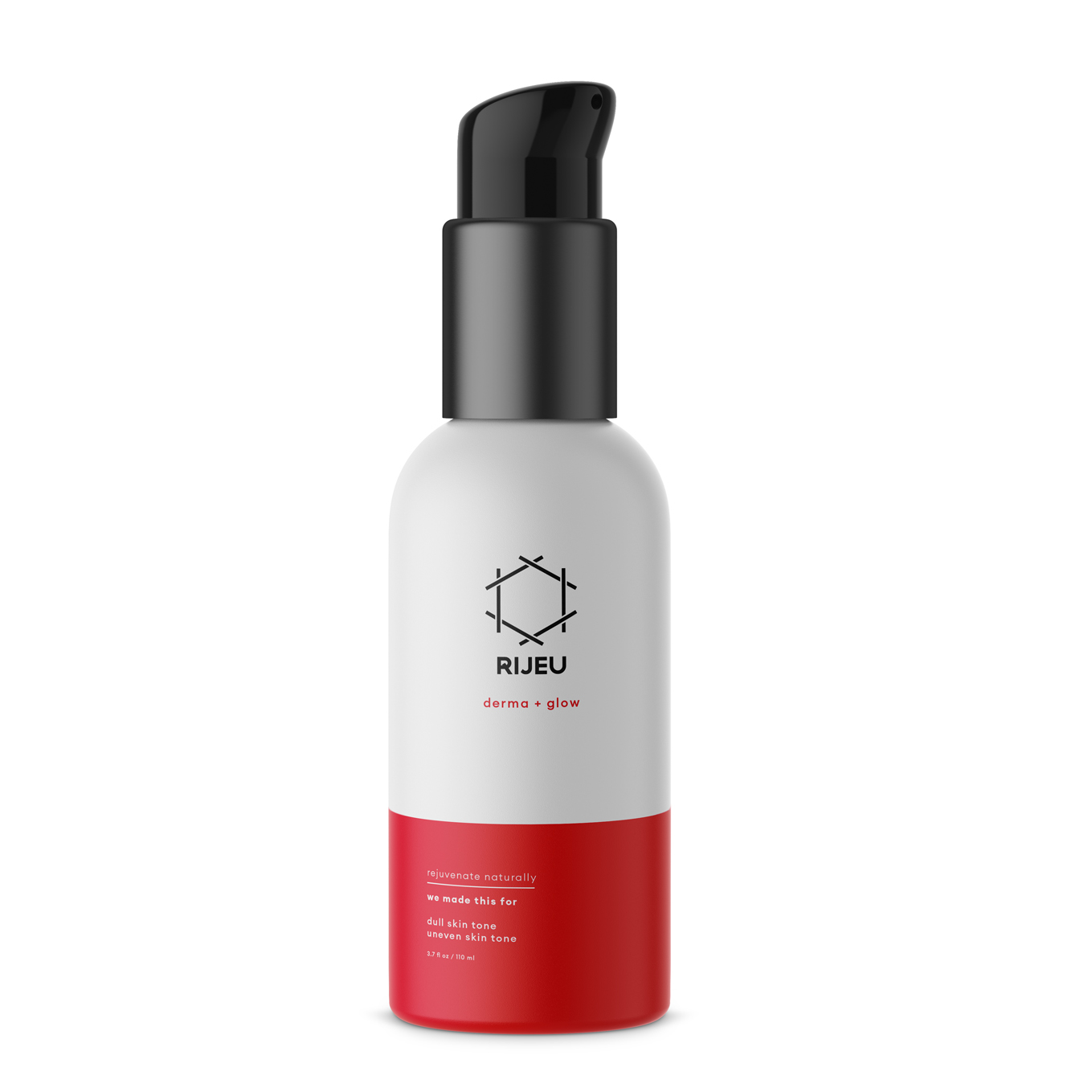
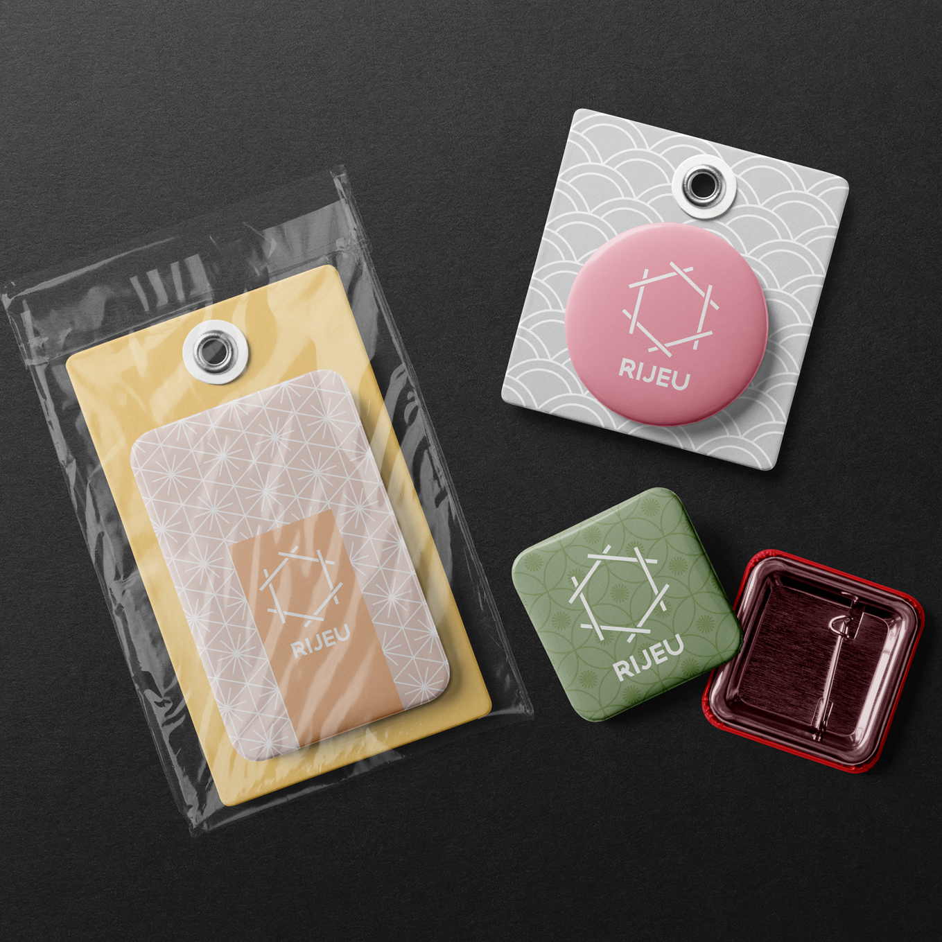
Naming and visual identity for a self-care line based in Korea, utilizing a unique mechanism to naturally enhance the efficacy of a diverse range of products, including aesthetic enhancements and skincare solutions.
Rijeu
Brand Identity / Naming
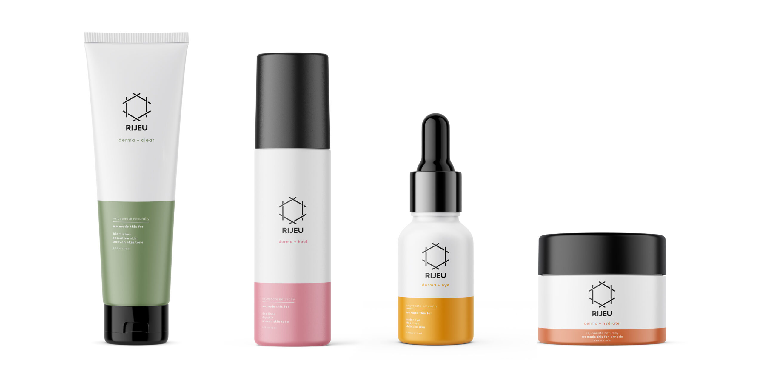
This product is all about self-care and rejuvenation, restoration, revitalization and radiance. In the comfort of one’s own home, Rijeu can be applied to combat the effects of aging such as fine lines and uneven skin tone.
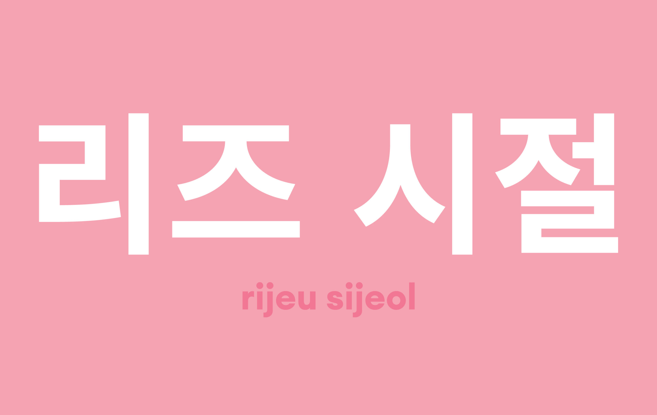
The word rijeu is a Korean word that comes from the expression, rijeu sijeol, shortened simply to rijeu. In Korea, this word is more than just a term – it’s a feeling. It captures that fleeting period in life when we are young and beautiful, full of endless possibilities and boundless energy. This makes it an ideal name for a product that seeks to transport the customer back to that magical time.
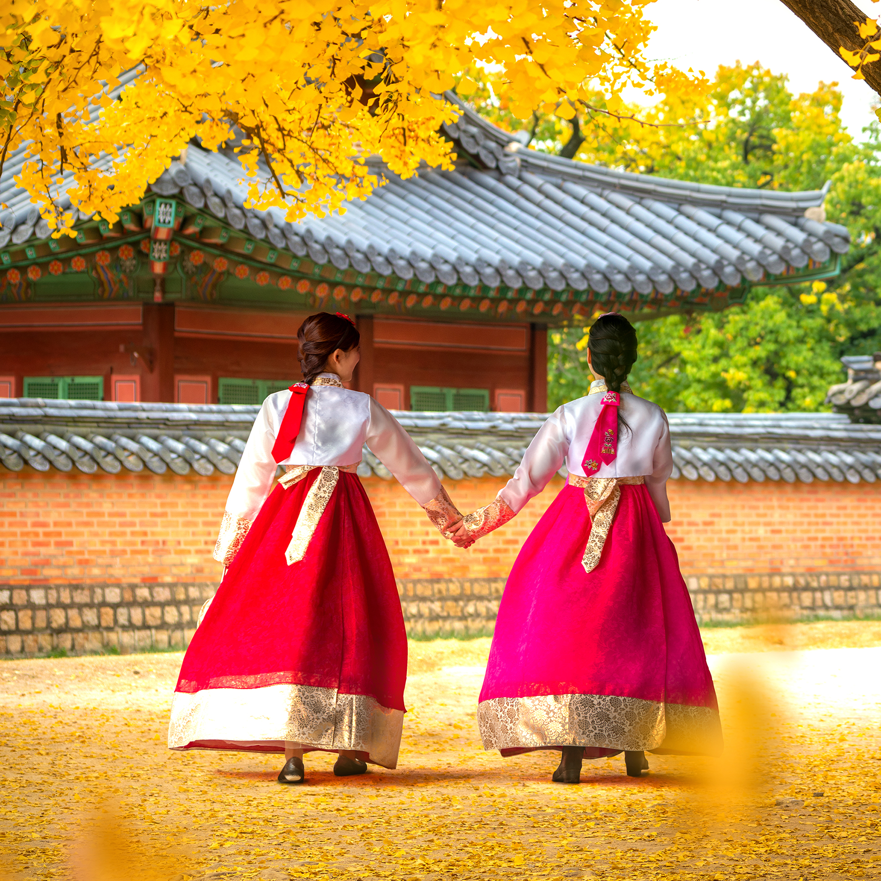
Not only does rijeu describe the mission of the product, it also pays homage to Korea, the country where it was born, and taps into the exploding K-Beauty trend. Short and sweet, rijeu has a pleasant, familiar ring to it for the customer based in the United States – reminiscent of its English counterparts like rejuvenate and renew.
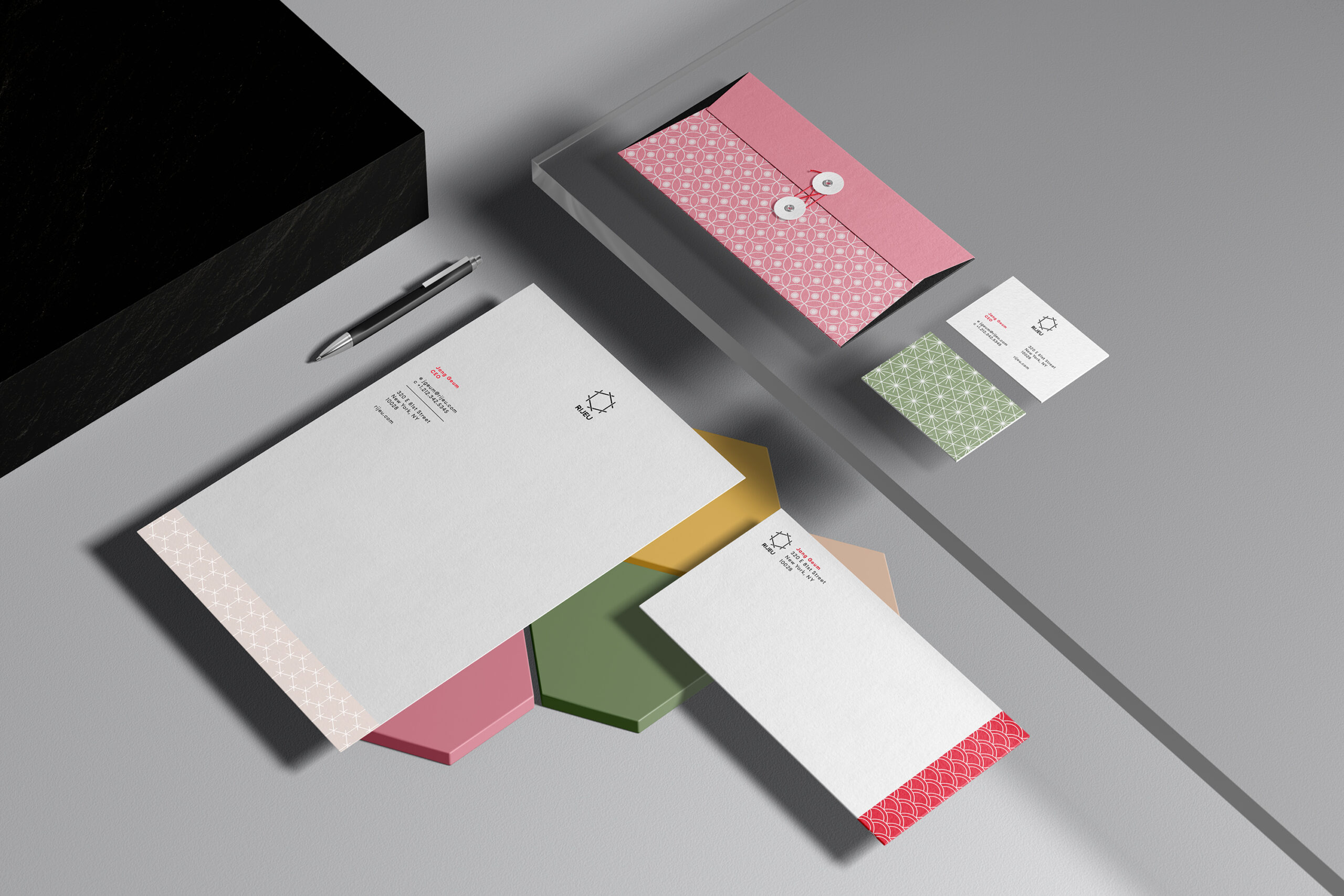
Project Team
Creative Director / Designer / Naming: Stephanie Halmich